1 Introduction
My post series from the unsupervised machine learning area about cluster algorithms is slowly coming to an end. However, what cluster algorithm cannot be missing in any case is Spectral Clustering. And this is what the following post is about.
2 Loading the libraries
import pandas as pd
import numpy as np

import matplotlib.pyplot as plt
import seaborn as sns
sns.set_style('darkgrid', {'axes.facecolor': '.9'})
sns.set_palette(palette='deep')
sns_c = sns.color_palette(palette='deep')
%matplotlib inline
from pandas.plotting import register_matplotlib_converters
register_matplotlib_converters()
from itertools import chain

from sklearn.cluster import KMeans
from sklearn.cluster import SpectralClustering
3 Introducing Spectral Clustering
As we know from the well-known k-Means algorithm (also a cluster algorithm), it has the following main problems:
- It makes assumption on the shape of the data (a round sphere, a radial basis)
- It requires multiple restarts at times to find the local minima (i.e. the best clustering)
Spectral Clustering algorithm helps to solve these two problems. This algorithm relies on the power of graphs and the proximity between the data points in order to cluster them, makes it possible to avoid the sphere shape cluster that the k-Means algorithm forces us to assume.
The functionality of the Spectral Clustering algorithm can be described in the following steps:
- constructing a nearest neighbours graph (KNN graph) or radius based graph
- Embed the data points in low dimensional space (spectral embedding) in which the clusters are more obvious with the use of eigenvectors of the graph Laplacian
- Use the lowest eigen value in order to choose the eigenvector for the cluster
4 Generating some test data
For the following example, I will generate some sample data. Since these should be a little fancy we need the following functions:
def generate_circle_sample_data(r, n, sigma):
    """Generate circle data with random Gaussian noise."""
    angles = np.random.uniform(low=0, high=2*np.pi, size=n)

    x_epsilon = np.random.normal(loc=0.0, scale=sigma, size=n)
    y_epsilon = np.random.normal(loc=0.0, scale=sigma, size=n)

    x = r*np.cos(angles) + x_epsilon
    y = r*np.sin(angles) + y_epsilon
    return x, y


def generate_concentric_circles_data(param_list):
    """Generates many circle data with random Gaussian noise."""
    coordinates = [
        generate_circle_sample_data(param[0], param[1], param[2])
     for param in param_list
    ]
    return coordinates
# Set global plot parameters.
plt.rcParams['figure.figsize'] = [8, 8]
plt.rcParams['figure.dpi'] = 80
# Number of points per circle.
n = 1000
# Radius.
r_list =[2, 4, 6]
# Standar deviation (Gaussian noise).
sigmas = [0.1, 0.25, 0.5]
param_lists = [[(r, n, sigma) for r in r_list] for sigma in sigmas]
# We store the data on this list.
coordinates_list = []
fig, axes = plt.subplots(1, 3, figsize=(15, 5))
for i, param_list in enumerate(param_lists):
coordinates = generate_concentric_circles_data(param_list)
coordinates_list.append(coordinates)
ax = axes[i]
for j in range(0, len(coordinates)):
x, y = coordinates[j]
sns.scatterplot(x=x, y=y, color='black', ax=ax)
ax.set(title=f'$\sigma$ = {param_list[0][2]}')
plt.tight_layout()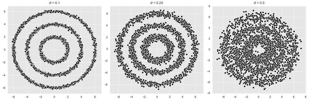
For the following cluster procedures we use the first graphic (shown on the left) and extract its points into a separate data frame.
coordinates = coordinates_list[0]

def data_frame_from_coordinates(coordinates):
    """From coordinates to data frame."""
    xs = chain(*[c[0] for c in coordinates])
    ys = chain(*[c[1] for c in coordinates])

    return pd.DataFrame(data={'x': xs, 'y': ys})

data_df = data_frame_from_coordinates(coordinates)

data_df.head()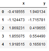
These are the data we will use:
# Plot the input data.
fig, ax = plt.subplots(figsize=(5, 5))
sns.scatterplot(x='x', y='y', color='black', data=data_df, ax=ax)
ax.set(title='Input Data')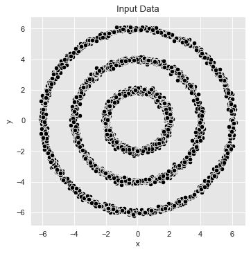
5 k-Means
We know the following steps from the detailed “k-Means Clustering” post.
What I want to show is how well the k-Means algorithm works with this cluster problem.
Sum_of_squared_distances = []
K = range(1,10)
for k in K:
    km = KMeans(n_clusters=k)
    km = km.fit(data_df)
    Sum_of_squared_distances.append(km.inertia_)
plt.plot(K, Sum_of_squared_distances, 'bx-')
plt.xlabel('k')
plt.ylabel('Sum_of_squared_distances')
plt.title('Elbow Method For Optimal k')
plt.show()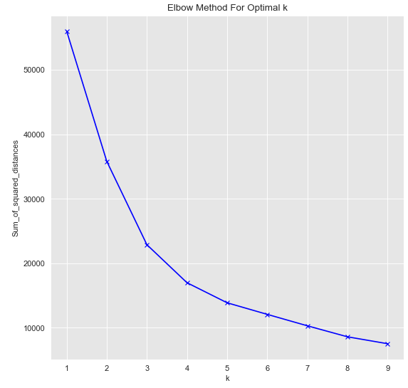
As we can see optimal k=3.
kmeans = KMeans(n_clusters=3)
kmeans.fit(data_df)
cluster = kmeans.predict(data_df)Let’s plot the result:
cluster = ['k-means_c_' + str(c) for c in cluster]

fig, ax = plt.subplots()
sns.scatterplot(x='x', y='y', data=data_df.assign(cluster = cluster), hue='cluster', ax=ax)
ax.set(title='K-Means Clustering')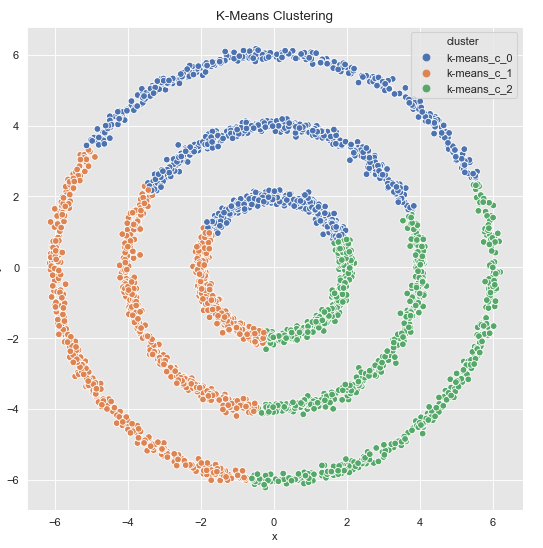
As expected, the k-Means algorithm shows poor performance here. Let’s see how the Spectral Clustering algorithm performs.
6 Spectral Clustering
spec_cl = SpectralClustering(
    n_clusters=3,
    n_neighbors=20,
    affinity='nearest_neighbors')
cluster = spec_cl.fit_predict(data_df)cluster = ['k-means_c_' + str(c) for c in cluster]
fig, ax = plt.subplots()
sns.scatterplot(x='x', y='y', data=data_df.assign(cluster = cluster), hue='cluster', ax=ax)
ax.set(title='Spectral Clustering')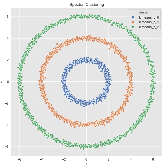
Perfect ! But this is not the only solution.
7 Digression: Feature-Engineering & k-Means
In concrete applications is sometimes hard to evaluate which clustering algorithm to choose. I therefore often use feature engineering and proceed, if possible, with k-means due to speed factors.
Let’s take a second look at the dataset we created.
data_df
This time we add the calculated r2 to the data set:
data_df = data_df.assign(r2 = lambda x: np.power(x['x'], 2) + np.power(x['y'], 2))

data_df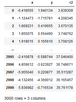
Now let’s plot our generated r2:
fig, ax = plt.subplots()
sns.scatterplot(x='r2', y='r2', color='black', data=data_df, ax=ax)
ax.set(title='Radius Feature')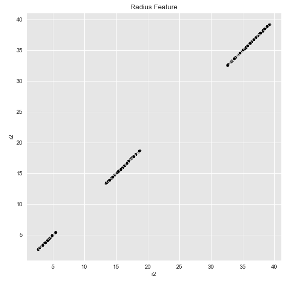
This now seems to be separable for k-Means as well. Let’s check it out:
Sum_of_squared_distances = []
K = range(1,10)
for k in K:
    km = KMeans(n_clusters=k)
    km = km.fit(data_df)
    Sum_of_squared_distances.append(km.inertia_)
plt.plot(K, Sum_of_squared_distances, 'bx-')
plt.xlabel('k')
plt.ylabel('Sum_of_squared_distances')
plt.title('Elbow Method For Optimal k')
plt.show()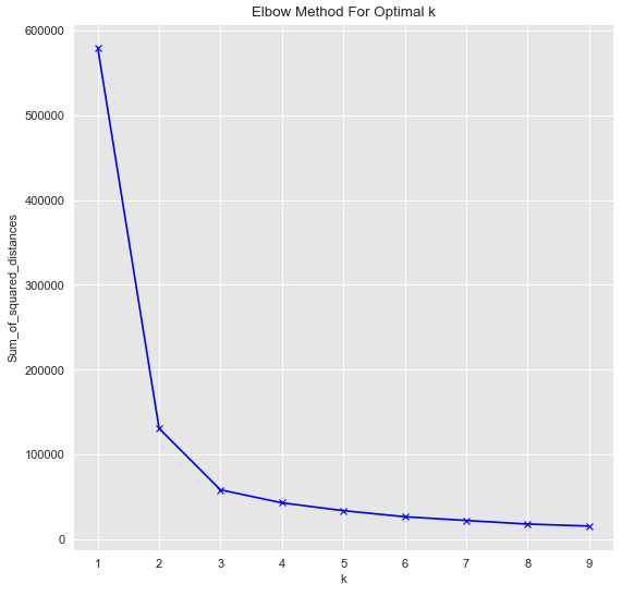
kmeans = KMeans(n_clusters=3)
kmeans.fit(data_df[['r2']])
cluster = kmeans.predict(data_df[['r2']])Note at this point: k-Means is only applied to the variable r2, not to the complete data set.
cluster = ['k-means_c_' + str(c) for c in cluster]

fig, ax = plt.subplots()
sns.scatterplot(x='r2', y='r2', data=data_df.assign(cluster = cluster), hue='cluster', ax=ax)
ax.set(title='K-Means Clustering')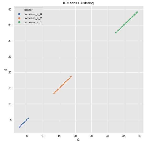
Finally, we visualize the original data with the corresponding clusters.
# This time I commented out the first of the following commands, otherwise the legend of the graphic will be labeled twice.
#cluster = ['k-means_c_' + str(c) for c in cluster]

fig, ax = plt.subplots()
sns.scatterplot(x='x', y='y', data=data_df.assign(cluster = cluster), hue='cluster', ax=ax)
ax.set(title='K-Means Clustering')
As we can see, the k-Means algorithm now also separates the data as desired. For the matter of the commented-out line, however, the following work-around can be used. We save the predicted labels as a variable to the original record.
data_df = data_df.assign(cluster = ['k-means_c_' + str(c) for c in cluster])

data_df.head()
Now we can plot without any problems.
fig, ax = plt.subplots()
sns.scatterplot(x='r2', y='r2', hue='cluster', data=data_df, ax=ax)
ax.set(title='Radius Feature (K-Means)')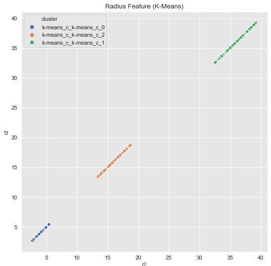
fig, ax = plt.subplots()
sns.scatterplot(x='x', y='y', hue='cluster', data=data_df, ax=ax)
ax.set(title='Radius Feature (K-Means)')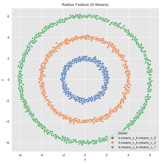
8 Conclusion
In this post I have shown the advantages of spectral clustering over conventional cluster algorithms and how this algorithm can be used. I have also shown how feature engineering in combination with the k-Means algorithms can be used to achieve equally good results.