1 Introduction
The second cluster algorithm I would like present is hierarchical clustering. Hierarchical clustering is also a type of unsupervised machine learning algorithm used to cluster unlabeled data points within a dataset. Like “k-Means Clustering”, hierarchical clustering also groups together the data points with similar characteristics.
For this post the dataset Mall_Customers from the statistic platform “Kaggle” was used. You can download it from my “GitHub Repository”.
2 Loading the libraries
import pandas as pd
import numpy as np

import matplotlib.pyplot as plt

from sklearn.cluster import KMeans

from sklearn.preprocessing import StandardScaler
from sklearn.preprocessing import MinMaxScaler
3 Introducing hierarchical clustering
Theory of hierarchical clustering
There are two types of hierarchical clustering:
- Agglomerative and
- Divisive
In the course of the first variant, data points are clustered using a bottom-up approach starting with individual data points, while in the second variant top-down approach is followed where all the data points are treated as one big cluster and the clustering process involves dividing the one big cluster into several small clusters.
In this post we will focus on agglomerative clustering that involves the bottom-up approach since this method is used almost exclusively in the real world.
Steps to perform hierarchical clustering
Following are the steps involved in agglomerative clustering:
- At the beginning, treat each data point as one cluster. Therefore, the number of clusters at the start will be k, while k is an integer representing the number of data points
- Second: Form a cluster by joining the two closest data points resulting in k-1 clusters
- Third: Form more clusters by joining the two closest clusters resulting in k-2 clusters
Repeat the above three steps until one big cluster is formed. Once single cluster is formed, dendrograms are used to divide into multiple clusters depending upon the problem.
4 Dendrograms explained
Let me explain the use of dendrograms with the following example dataframe.
df = pd.DataFrame({'Col1': [5, 9, 13, 22, 31, 90, 81, 70, 45, 73, 85],
                   'Col2': [2, 8, 11, 10, 25, 80, 90, 80, 60, 62, 90]})
df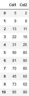
First we’ll convert this dataframe to a numpy array.
arr = np.array(df)
arr
Now we plot the example dataframe:
labels = range(1, 12)
plt.figure(figsize=(10, 7))
plt.subplots_adjust(bottom=0.1)
plt.scatter(arr[:,0],arr[:,1], label='True Position')

for label, x, y in zip(labels, arr[:, 0], arr[:, 1]):
    plt.annotate(
        label,
        xy=(x, y), xytext=(-3, 3),
        textcoords='offset points', ha='right', va='bottom')
plt.show()
Now we have a rough idea of the underlying distribution of the data points. Let’s plot our first dendrogram:
linked = shc.linkage(arr, 'single')

labelList = range(1, 12)

plt.figure(figsize=(10, 7))
shc.dendrogram(linked,
            orientation='top',
            labels=labelList,
            distance_sort='descending',
            show_leaf_counts=True)
plt.axhline(y=23, color='r', linestyle='--')
plt.show()
The algorithm starts by finding the two points that are closest to each other on the basis of euclidean distance. The vertical height of the dendogram shows the euclidean distances between points.
In the end, we can read from the present graphic that data points 1-5 forms a cluster as well as 6,7,8, 10 and 11. Data point 9 seems to be a own cluster.
We can see that the largest vertical distance without any horizontal line passing through it is represented by blue line. So I draw a horizontal red line within the dendogram that passes through the blue line. Since it crosses the blue line at three points, therefore the number of clusters will be 3.
5 Hierarchical Clustering with Scikit-Learn
Now it’s time to use scikits’AgglomerativeClustering class and call its fit_predict method to predict the clusters that each data point belongs to.
hc = AgglomerativeClustering(n_clusters=3, affinity='euclidean', linkage='ward')
hc.fit_predict(arr)
Finally, let’s plot our clusters.
plt.scatter(arr[:,0],arr[:,1], c=hc.labels_, cmap='rainbow')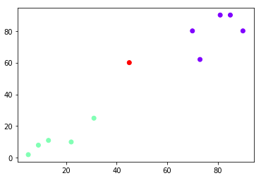
6 Hierarchical clustering on real-world data
That was an easy example of how to use dendograms and the AgglomerativeClustering algorithm. Now let’s see how it works with real-world data.
df = pd.read_csv("Mall_Customers.csv")
mall = df.drop(['CustomerID', 'Gender'], axis=1)
mall
The steps are similar as before.
mall_arr = np.array(mall)plt.figure(figsize=(10, 7))
plt.title("Customer Dendograms")
plt.axhline(y=350, color='r', linestyle='--')
dend = shc.dendrogram(shc.linkage(mall_arr, method='ward'))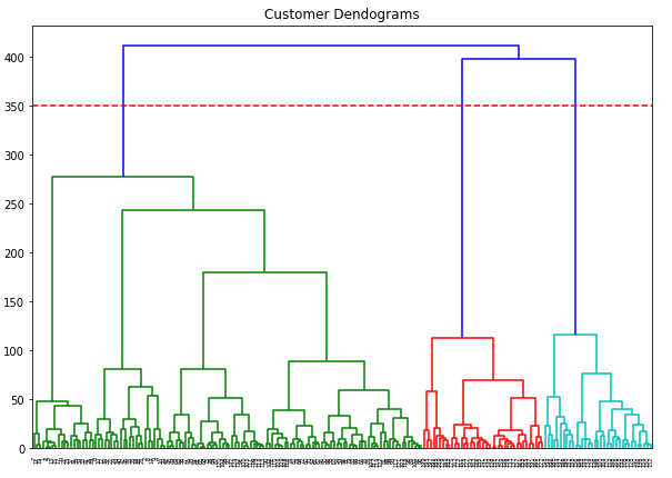
I have again drawn the threshold I chose with a red line. Now it’s time for some predictions:
hc = AgglomerativeClustering(n_clusters=3, affinity='euclidean', linkage='ward')
predictions = hc.fit_predict(mall_arr)
predictions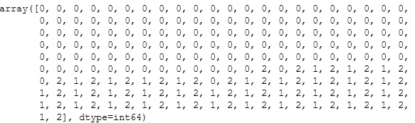
plt.figure(figsize=(10, 7))
plt.scatter(mall_arr[:,0],mall_arr[:,1], c=hc.labels_, cmap='rainbow')
plt.title("Plot of the clusters")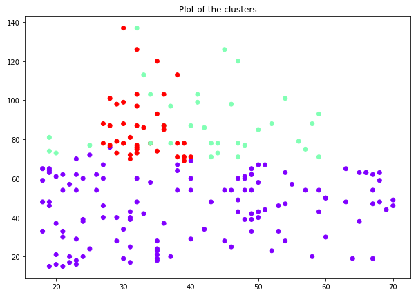
That looks a bit messy now … let’s see if we can do it better if we take out the variable age.
mall = mall.drop(['Age'], axis=1)
mall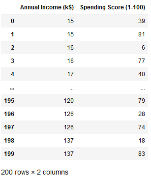
mall_arr = np.array(mall)plt.figure(figsize=(10, 7))
plt.title("Customer Dendograms")
plt.axhline(y=200, color='r', linestyle='--')
dend = shc.dendrogram(shc.linkage(mall_arr, method='ward'))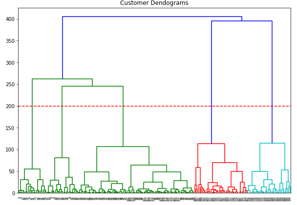
Very nice. Now there are apparently 5 clusters. Let’s do some predictions again.
hc = AgglomerativeClustering(n_clusters=5, affinity='euclidean', linkage='ward')
predictions = hc.fit_predict(mall_arr)
predictions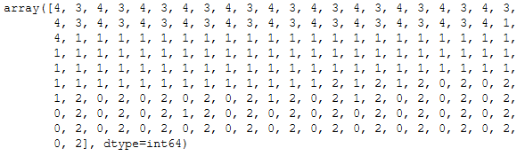
plt.figure(figsize=(10, 7))
plt.scatter(mall_arr[predictions==0, 0], mall_arr[predictions==0, 1], s=55, c='red', label ='Cluster 1')
plt.scatter(mall_arr[predictions==1, 0], mall_arr[predictions==1, 1], s=55, c='blue', label ='Cluster 2')
plt.scatter(mall_arr[predictions==2, 0], mall_arr[predictions==2, 1], s=55, c='green', label ='Cluster 3')
plt.scatter(mall_arr[predictions==3, 0], mall_arr[predictions==3, 1], s=55, c='cyan', label ='Cluster 4')
plt.scatter(mall_arr[predictions==4, 0], mall_arr[predictions==4, 1], s=55, c='magenta', label ='Cluster 5')

plt.title('Clusters of Mall Customers \n (Hierarchical Clustering Model)')
plt.xlabel('Annual Income(k$) \n\n Cluster1(Red), Cluster2 (Blue), Cluster3(Green), Cluster4(Cyan), Cluster5 (Magenta)')
plt.ylabel('Spending Score(1-100)')
plt.show()
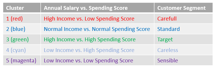
That looks useful now. What we can now read from the graphic are the customers’ segments.
I would have made the following interpretation:
Now that I want to examine the clusters more closely, I add the predictions to my data set. Be careful at this point since python always starts with 0 for counting. That is the reason why I use predictions + 1 in the code below. This way I generate clusters from 1-5.
df_pred = pd.DataFrame(predictions)

#be carefull here ... +1 because we start with count 1 python 0
mall['cluster'] = predictions + 1
mall.head()
In order to be able to better assess the target group, I add the variables ‘Age’ and ‘Gender’ from the original data set and filter according to the target group.
mall['age'] = df['Age']
mall['gender'] = df['Gender']

#filter for the target group
target_group = mall[(mall["cluster"] == 3)]
target_group.head()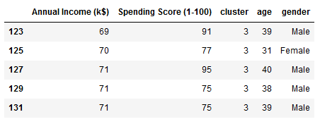
Now it’s time for some statistics:
df = target_group.agg(['mean', 'median', 'std', 'min', 'max']).reset_index()
df.drop(['cluster', 'gender'], axis=1)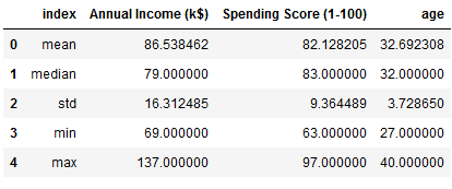
Last but not least, the division of men and women:
target_group['gender'].value_counts()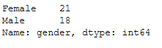
7 Conclusion
Unfortunately, the data set does not provide any other sensible variables. At this point it starts to get exciting and valuable knowledge about the different customer segments can be gained.