1 Introduction
Visualizations are part of the bread and butter business for any Data Analyst or Scientist. So far I have not dealt with this topic in any post.
This post is not imun to changes and additions. I will add more parts little by little.
2 Loading the libraries
import pandas as pd
import numpy as np

import matplotlib.pyplot as plt


import warnings
warnings.filterwarnings("ignore")
3 Line Chart
3.1 Creating the Data
df_line = pd.DataFrame({'Year': [2016,2017,2018,2019,2020,2021],
                        'Value': [5,8,6,15,13,16]})
df_line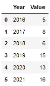
3.2 Simple Line Chart
plt.figure(figsize=(11,7))
plt.plot(df_line['Year'], df_line['Value'])

plt.title('Development over the Years')
plt.xlabel('Timeline')
plt.ylabel('Value in Kilograms (kg)')

plt.show()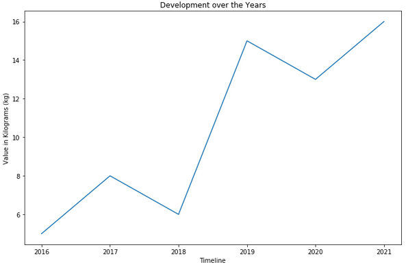
3.3 Prevention of unwanted Ticks
Sometimes it happens (especially when you have little data available) that a line chart shows unwanted ticks on the X-axis.
We therefore use only part of our sample data in the following example.
df_temp = df_line.head(2)
df_temp
plt.figure(figsize=(11,7))
plt.plot(df_temp['Year'], df_temp['Value'])

plt.title('Development over the Years')
plt.xlabel('Timeline')
plt.ylabel('Value in Kilograms (kg)')

plt.show()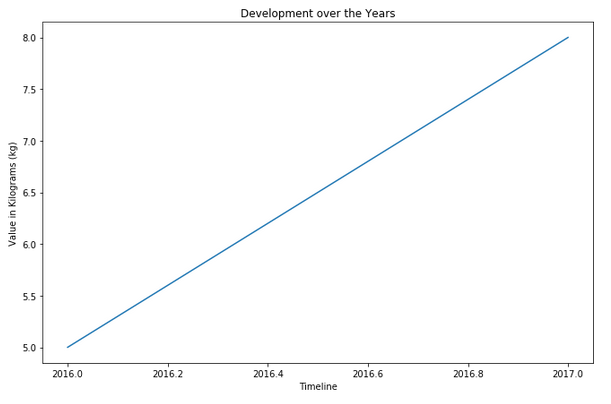
locator_params helps here:
plt.figure(figsize=(11,7))
plt.plot(df_temp['Year'], df_temp['Value'])


plt.locator_params(axis='x', nbins = df_temp.shape[0])


plt.title('Development over the Years')
plt.xlabel('Timeline')
plt.ylabel('Value in Kilograms (kg)')

plt.show()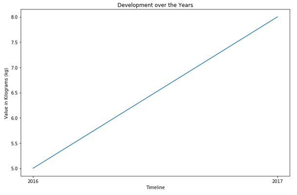
3.4 Configurations
3.4.1 Rotation of the X-Axis
plt.figure(figsize=(11,7))
plt.plot(df_line['Year'], df_line['Value'])

plt.xticks(rotation = 45) # Rotates X-Axis Ticks by 45-degrees

plt.title('Development over the Years')
plt.xlabel('Timeline')
plt.ylabel('Value in Kilograms (kg)')

plt.show()
3.4.2 Labeling of the Chart
3.4.2.1 Add a Subtitle
plt.figure(figsize=(11,7))
plt.plot(df_line['Year'], df_line['Value'])

plt.suptitle('Development over the Years', fontsize=15, x=0.52, y=0.96)
plt.title('From 2016 to 2021', ha='center')
plt.xlabel('Timeline')
plt.ylabel('Value in Kilograms (kg)')

plt.show()
The term subtitle is a bit misleading here, because under this method now the actual title is meant and with plt.title the subtitle.
You can manually set the position of the suptitle as described here: matplotlib.pyplot.suptitl
3.4.2.2 Show bold Labels
plt.figure(figsize=(11,7))
plt.plot(df_line['Year'], df_line['Value'])


plt.title('Development over the Years', fontsize=14.0, fontweight='bold')
plt.xlabel('Timeline', fontweight='bold')
plt.ylabel('Value in Kilograms (kg)', fontweight='bold')

plt.show()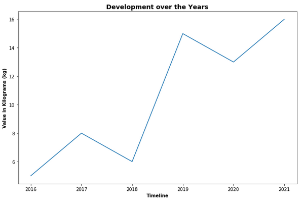
3.4.2.3 Add a Legend
plt.figure(figsize=(11,7))
plt.plot(df_line['Year'], df_line['Value'])


plt.title('Development over the Years')
plt.xlabel('Timeline')
plt.ylabel('Value in Kilograms (kg)')

plt.legend(loc="upper left")

plt.show()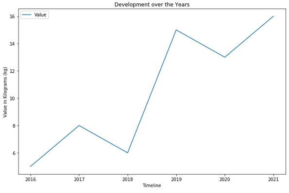
3.4.2.4 Add v-Lines
plt.figure(figsize=(11,7))
plt.plot(df_line['Year'], df_line['Value'])


plt.vlines(2017,
           df_line['Value'].min(),
           df_line['Value'].max(),
           colors='g', label = 'Production Increase', linestyles='dashed')
plt.vlines(2018,
           df_line['Value'].min(),
           df_line['Value'].max(),
           colors='r', label = 'Collapse of the economy', linestyles='dotted')
plt.vlines(2021 - 0.5,
           df_line['Value'].min(),
           df_line['Value'].max(),
           colors='lime', label = 'Economic recovery', linestyles='solid')
plt.legend(bbox_to_anchor = (1.0, 1), loc = 'upper left')


plt.title('Development over the Years')
plt.xlabel('Timeline')
plt.ylabel('Value in Kilograms (kg)')

plt.show()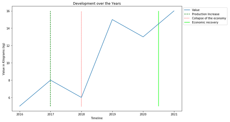
If you want to learn more about the use and functionality of v-lines see here:
3.5 Storage of the created Charts
plt.figure(figsize=(11,7))
plt.plot(df_line['Year'], df_line['Value'])


plt.vlines(2017,
           df_line['Value'].min(),
           df_line['Value'].max(),
           colors='g', label = 'Production Increase', linestyles='dashed')
plt.vlines(2018,
           df_line['Value'].min(),
           df_line['Value'].max(),
           colors='r', label = 'Collapse of the economy', linestyles='dotted')
plt.vlines(2021 - 0.5,
           df_line['Value'].min(),
           df_line['Value'].max(),
           colors='lime', label = 'Economic recovery', linestyles='solid')
plt.legend(bbox_to_anchor = (1.0, 1), loc = 'upper left')


plt.title('Development over the Years')
plt.xlabel('Timeline')
plt.ylabel('Value in Kilograms (kg)')


plt.savefig('Development over the Years.png', bbox_inches='tight')

plt.show()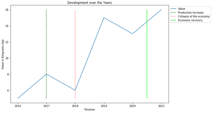
Note:
For normal graphics there is usually no need for another safefig option.
Since we have put the legend outside in our graphic for a better readability we must use here additionally bbox_inches='tight'!
Here is our saved image:

4 Conclusion
As mentioned at the beginning, I will gradually update this post with more visualization options.